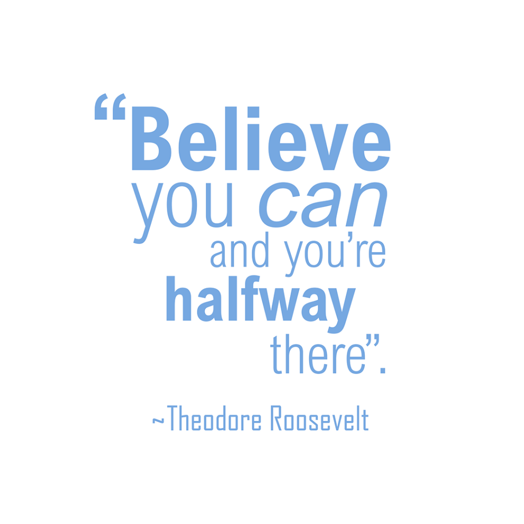
Quote – Student Challenge
Whilst on my Graphic Design course, I’ve reached the section about typography, where this is being covered in great depth. I have learnt about the difference between serif and sans serif, that varying style of font can make a bit impact, and that layout can drastically change the look of a design.
Here, I took a quote from online, and created a design applying the recent knowledge I have acquired with typography in Adobe Photoshop. This was the first task set by the lecturer. Your feedback is very welcome.